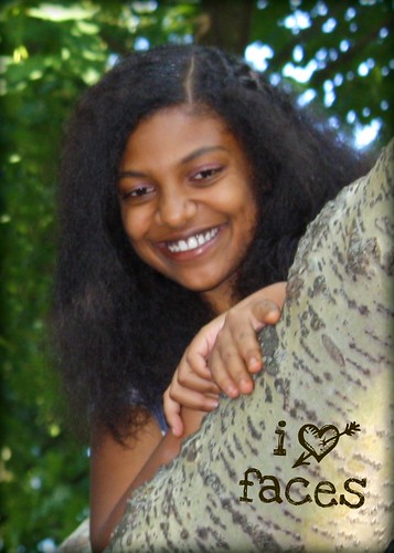
The theme this week at I Heart Faces is actually “I Heart Faces.” The idea is to creatively place the I Heart Faces logo into five of your photos. This was a good challenge for me. I don’t usually add words to my photos because I’m not sure how to make it look natural.
This one is my favorite. It doesn’t look natural, but I just think it’s funny.
I think the logo blends well in this one. I like the mood of this picture a lot.
Well, honestly, I just love this face. She’s beautiful. All the time. I wanted the logo to look like it was carved into the tree. Harder than it sounds.
I think this one is a kind of quirky fun. While it doesn’t look necessarily natural, I think it does blend in with the photo. Plus it’s a picture of one of my favorite people, so how can I not love it?
OK, I really wanted this one to look better than I think it does. The idea of the logo as syrup sounded good, but I had a hard time getting it to actually look like syrup.
What do you think? Which one is your favorite?
Check out the rest of the entries here:
I am submitting this photo into the I Heart Faces logo photo contest. By entering, I am granting I Heart Faces LLC permission to consider my photo for use in the marketing and promotion of their website.


The first one is very funny…love Barbara’s expression! I think I like the second one the best. Hope you guys are doing well! Happy New Year!
I love the potato holding girl. All wonderful though
Great stuff…love the second one!
I love them all! Seriously, they are all very creative and cute! Nice job!
Love the second one best! All are great. Thanks for your comment on my blog.
I love Laz’s expression…so him! Babs totally cracks me up! So hard to pick one!!
Well, I keep going back and forth to the point of having to say that they’re ALL my favorites! The first one just made me laugh out loud because of their expressions; perfect! Love the look in the second one… the beautiful girl in the third one… the fourth might be my favorite just because of the way the logo really “works” in it. And the last one… it made me wish that I had tried a picture using REAL syrup (maybe chocolate syrup?). Great entries; don’t you love this theme?
the first image is laugh-out-loud funny!! I love it!
it looks like you had fun brainstorming this challenge 🙂
I really like the second one!
I love, love, love the first one! Great job!
Great job! Thanks for sharing
The tree etching idea is a cute one!
great entries! the 2nd is my fave. beautiful photos!
um, duhh…. DAX. although, i think i would really heart a face in a tanktop doing exercises or a Penn sweatshirt on new year’s eve!