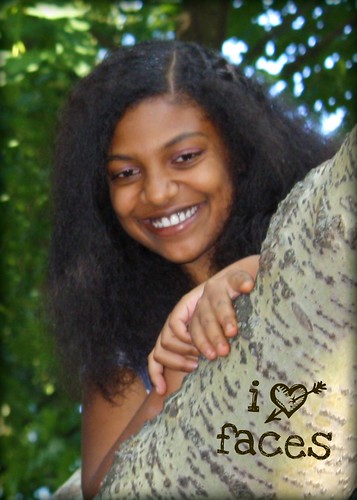
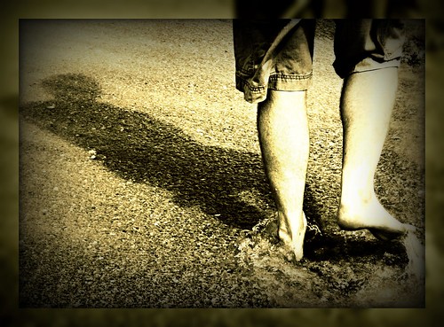
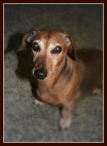
The theme this week at I Heart Faces is actually “I Heart Faces.” The idea is to creatively place the I Heart Faces logo into five of your photos. This was a good challenge for me. I don’t usually add words to my photos because I’m not sure how to make it look natural.
This one is my favorite. It doesn’t look natural, but I just think it’s funny.
I think the logo blends well in this one. I like the mood of this picture a lot.
Well, honestly, I just love this face. She’s beautiful. All the time. I wanted the logo to look like it was carved into the tree. Harder than it sounds.
I think this one is a kind of quirky fun. While it doesn’t look necessarily natural, I think it does blend in with the photo. Plus it’s a picture of one of my favorite people, so how can I not love it?
OK, I really wanted this one to look better than I think it does. The idea of the logo as syrup sounded good, but I had a hard time getting it to actually look like syrup.
What do you think? Which one is your favorite?
Check out the rest of the entries here:
I am submitting this photo into the I Heart Faces logo photo contest. By entering, I am granting I Heart Faces LLC permission to consider my photo for use in the marketing and promotion of their website.


